← All workRiskFloor · Behavioural design · 2026 · Case study 1 of 4
The lean comes last
Designing an AI briefing that shows its read and still leaves the decision to the trader.
Context
RiskFloor is a pre-trade briefing for retail traders: an AI-written read of the bull case, the bear case, key levels and what would prove it wrong. The engine doesn't stop at a summary. It weighs the evidence and arrives at a lean, a direction it lands on more than the other.
The problem
That lean is the most dangerous thing on the page. Hide it, and the product pretends it has no view when it does. Put it first, in a big coloured badge, and it reads as an instruction. The research I worked from argues that once a reader has an answer, they tend to stop weighing the evidence behind it.
So the design question was narrow: how do you show a dense, sourced argument for both sides, plus the product's own read, without the read doing the trader's thinking for them?
What the research said, and what happened
A few months into building, I ran several rounds of AI-assisted desk research on how people make decisions under uncertainty, with Gemini, GPT and Claude summarizing the behavioural literature. Its top recommendation shipped, went almost unused, and was removed. What survived became a short set of rules.
The lesson I took: research tells you where to look. It doesn't tell you what people will do.
Decision 1: The evidence leads, the lean follows
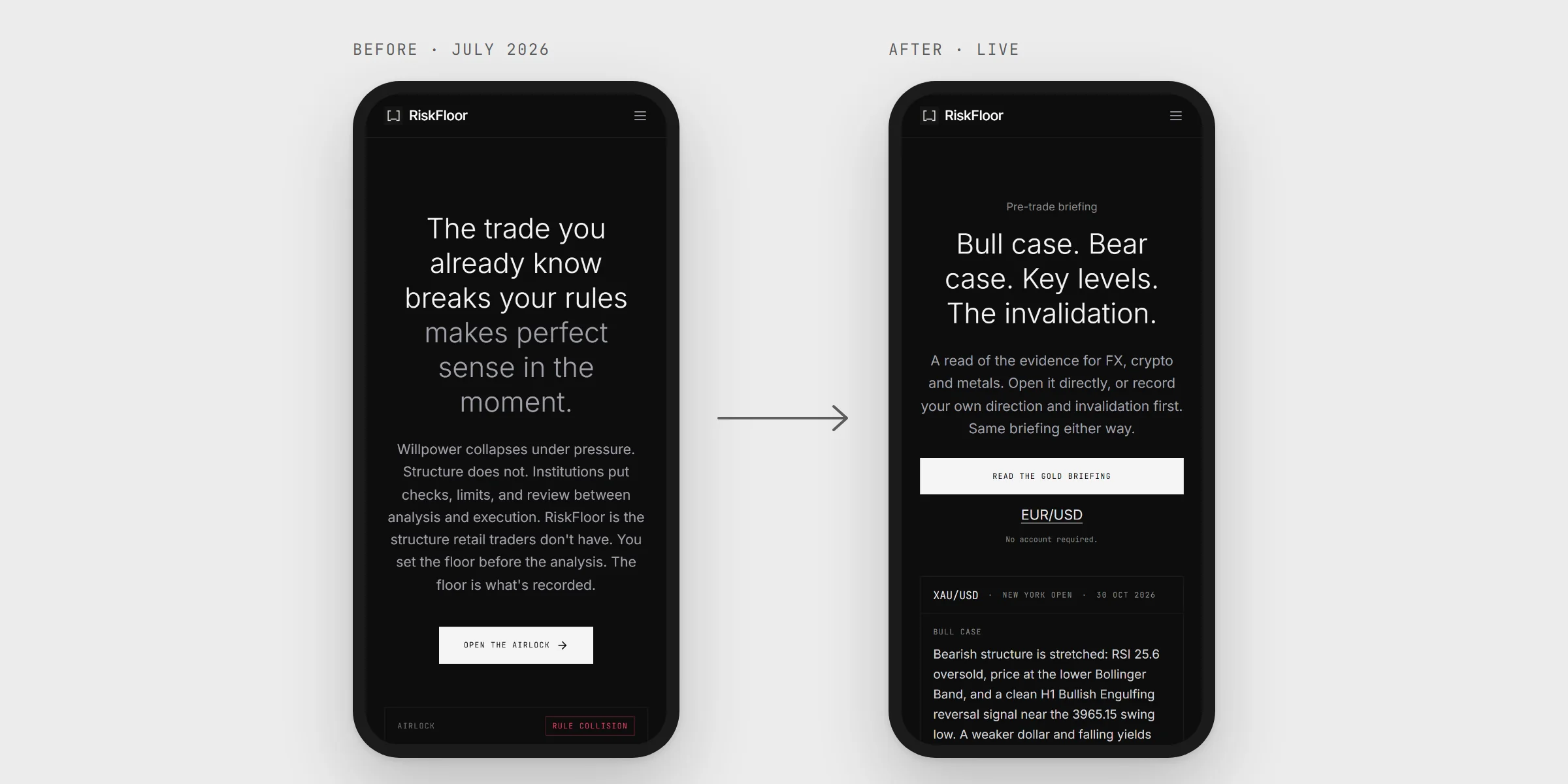
In August I removed a large lean badge I had designed myself, from the top of the briefing. It read as the answer, so everything below it read as justification. The ruling I wrote that day: "The evidence leads; the lean follows."
The same week I set a colour rule. Colour on the lean "turns the lean into an instruction", so the product's own read is always grey. And amber means the product is asking the trader to pause, so a number that merely went down is never painted amber.
When I set the rule, I logged the audit of the rest of the product as not done, and it stayed not done until November. An audit I asked for then found the lean bar still turned amber on bearish reads, and the economic calendar painted misses amber too. The fix makes both neutral and adds tests that fail the build if colour returns. Fixing it forced me to write the boundary down: measured market data may show which way it moved; RiskFloor's own read may not carry colour at all.
Decision 2: The analysis never sees the trader's view
Traders can record their own read before opening a briefing, and it would be easy to feed that record into the analysis. I decided the opposite in August: the briefing is built without it. If the engine knew which way the trader leaned, its read could drift toward agreeing with them, and the trader would be anchoring the product instead of the other way round.
The check is simple. Across 362 briefing runs, the trader's recorded view reached the engine 0 times.
The rule has a second half. A record only counts if it was made before the trader saw the analysis. I found a path where a "before" record could be saved after viewing, and moved that check to the server, so the browser no longer decides what counts as "before".
The mandatory version of this step didn't survive (that story is case study 2). The integrity rule did.
Decision 3: Equal cases, in an order that doesn't sell
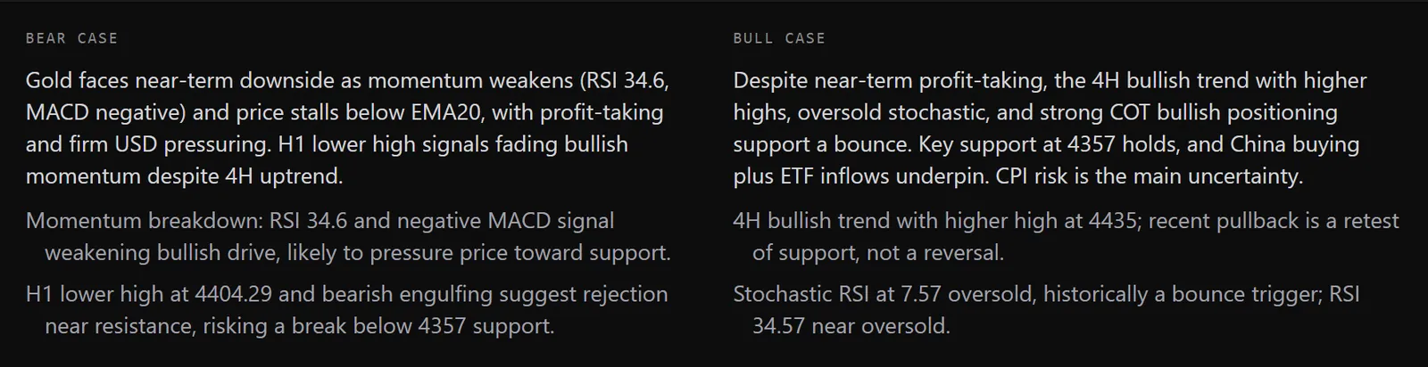
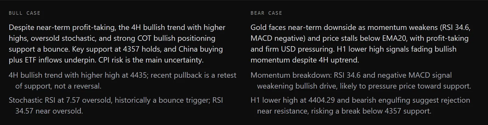
Every briefing makes a bull case and a bear case. If one gets bigger type, more claims, or more of the screen, the page is arguing for it, whatever the words say. So both cases use the same type and the same number of supporting claims. On a laptop they sit side by side; on a phone, where they can't, they sit behind two equal tabs, so neither is cut short. If a narrow screen cut one side short, that side would quietly lose.
Order was harder. In August I put the bear case first in the homepage's briefing preview. It was the cheapest signal I had that the page wasn't selling a direction.
In September I reversed it, for three reasons. The preview contradicted the headline above it. Whatever you read first reads as the lead, so bear-first was simply a lean the other way, the exact thing it was meant to avoid. And on a phone, the bear case sat alone at the top of the screen.
The preview now runs bull on the left, bear on the right. Bull then bear is the order readers expect, so it reads as convention rather than a choice, where bear-first had read as a deliberate one. And side by side, with the same type and the same number of claims, neither case leads. The test that had checked for bear-first was inverted, not loosened: it now checks for bull-left just as strictly, and equal weight never moved.
Decision 4: Dense evidence, collapsed by default and in order
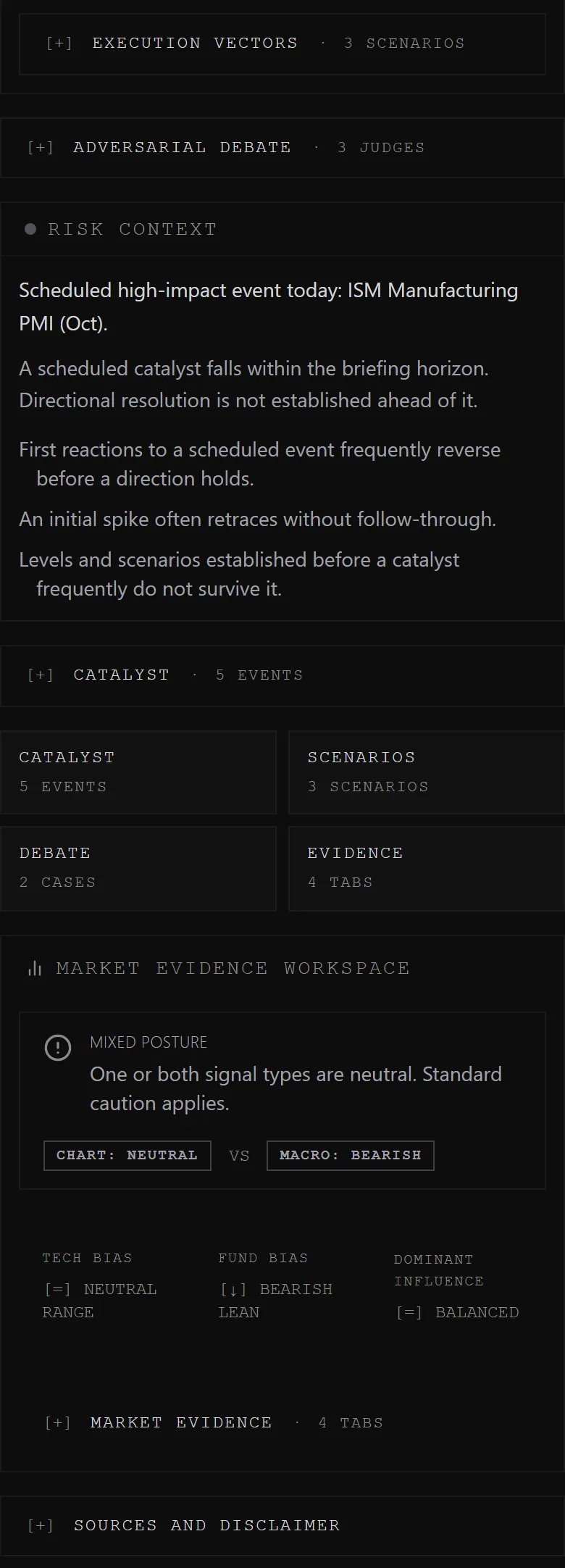
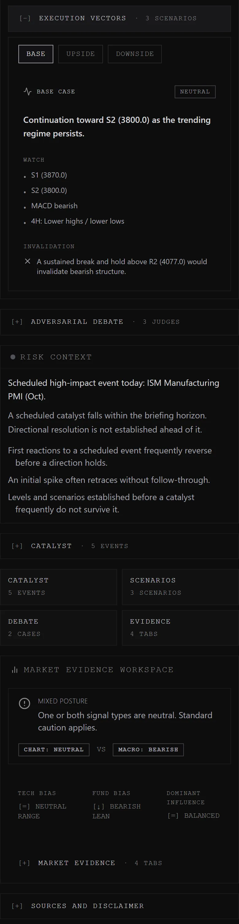
A full briefing is long: the vectors (a one-line read of each timeframe), the debate between the two cases, and the sourced evidence behind each claim. Shown all at once, it buries the decision under the material. Hidden behind tabs, it hides that the material exists.
So the sections run in a fixed order: the vectors first, then the debate, then the evidence, and the structure is visible without a single click. On a phone, every section starts collapsed, so a trader sees the shape of the argument in a few seconds and opens only what they want to check. On a laptop, where there's room, the scenarios stay visible and the debate opens by default. The ruling that set this says the page should show "the decision, not the corpus".
Two smaller rules sit beside it. Page order implies cause and effect, so the order is part of the argument, not decoration. The ruling's phrase: "copy cannot outrun layout". And a slot on the page has to earn its content: when a signal has nothing honest to say, its space stays empty rather than showing a placeholder that looks like data, the same rule behind my label audit.
The desk research pointed in this direction (overview first, detail on demand), but I have no reading data to show it works. I don't know how many traders open the evidence.
What happened
Two of the four rules are held by tests: colour can't return to the lean, and the two cases can't lose their order. The before-viewing rule is checked on the server, and the trader's view never reaches the engine. The collapsed layout is held by nothing except the layout itself.
A separate check removed something of mine. The briefing used to show a small directional chip, an up-or-down probability. When I scored it against what the market actually did, it was slightly worse than always guessing 50/50. I took it off the briefing and the public homepage in August. Showing a read neutrally doesn't make the read any good, and a number with no skill behind it shouldn't be on the page at all.
Honest limits
- No user research, no usability test, and no evidence that any of this changed how traders decide. The product is too small for a fair test, and I haven't run one.
- The research was AI-assisted desk research. Models summarized the literature. I haven't checked every paper at its source, and the top recommendation was overturned, so the line from research to product isn't neat.
- Most of the critique came from AI models acting as reviewers. I also asked a couple of trader friends for their opinions, informally. None of this was user research, and I don't present it as user research. Several of the later rules were first proposed by an AI reviewer and adopted by me; I made the call on each.
- The rules didn't hold by themselves. The amber lean bar sat in the live product for three months after I'd decided against it, until an audit caught it.
What I learned
- Layout argues before copy does. Size, colour and order all take a side. You can't fix a page that leans by rewording it.
- A rule only covers what you check. I set the colour rule, left its audit undone, and the lean bar broke it for three months.
- Neutral isn't the same as right. The design can keep the read from pushing the trader. Whether the read deserves attention at all is a separate question, and the honest answer for the directional chip was no.